
Saturday 3 September 2011
Thursday 28 April 2011
Issues, as per usual
We're having problems uploading the evaluation to our blog, it seems that whenever i try to upload it i recieve an update informing me that a recent attack on my computor system was blocked and the process of uploading the video has so far taken over an hour with no progress and no upload.
Sorry for the delay, it will be uploaded asap.
Thankyou.
Sorry for the delay, it will be uploaded asap.
Thankyou.
Wednesday 27 April 2011
Final version of the Digipak
Here is the final version of the digipak, there are a couple of changes from the previous one added...


Friday 4 March 2011
Website Complete (Finally)...
The finishing touches have been made to our website, read the previous post on the website for an in-depth analysis of it. Follow this link.
Evaluation Finished!
After days of editing, we finally finished our evaluation and we have given in a copy to our teacher on a digistick. We filmed most of it using a green screen which looks very good, but as we found out when editing, does mean a lot of harf work. We'll upload our evaluation here as soon as possible.
Tuesday 1 March 2011
Evaluation Script:
Media Evaluation Script:
Q1: In what ways does your media product use, develop or challenge forms and conventions of real media products?
As a group we inspired to create a music video that adhered to the conventions of a real music video. To help achieve this, we researched “Goodwin’s 6” which identifies the typical conventions of a music video:
- a relationship between music and visuals,
- a relationship between lyrics and visuals,
- a demand for close-up shots,
- the notion of “looking”,
- Intertextuality.
We believe we have included all of these things, for example, our images change on the beat of the track as we have tried to make a relationship between the visuals and the rhythm a motif throughout our music video. The themes in the lyrics are of exploration, searching and discovery which we have tried to demonstrate through the narrative scenes in our music video. The landscape shots we used in our music video represent the audience themselves exploring and searching their surroundings and this helps to include the audience within the video and make them involved in what is happening. We incorporated the demand for close-up’s rather begrudgingly in our music video because it was the plan from the beginning that during the video we would slowly reveal the two singers in the video until on the last line they would see them, in there entirety . We did this so that the audience would themselves be exploring and trying to see the singer’s faces and this would help link the lyrics to visuals, another of Goodwin’s 6. However, when it came to filming our video it was very unpractical and also unconventional, so we decided to scrap that idea and we include many close-up shots of the band. We also included “the notion of looking” in our video, shown by the singers looking directly at the camera on many occasions, as we thought it complemented our theme of “searching and exploration”.
Here you can see that we have included 5 of Goodwin’s 6 rules of a conventional music video so we have tried to challenge the typical conventions of real music video products by not including a lot of “Intertextuality”. We did this to make our video “original” and a breath of fresh air when compared to a lot of stereotypical music videos.
Our media product challenges other real media products by its simplicity and clear themes. We have represented our themes of “exploration”, “discovery” and “nature” very clearly in our video. We have shown our theme of “Nature” by filming entirely outdoors by a lake and in woodland. “Exploration” and “discovery” our represented in our video through the narrative of people searching through a wood to find each other and eventually discovering each other beside a lake. The simplicity of these three themes makes our video unconventional compared to many other complex music videos with a convoluted and confusing array of themes and representations: These types of music videos are most prevalent in the indie genre, the same as our music video.
Q2: How effective is the combination of your main product and ancillary texts?
We wanted to make all of our media products to have aspects of synergy; where different things work together advantageously to create a better final product. We have achieved this by creating similar logos on all of our products and incorporating the same settings on all of our products: woodlands, forests and lakes. We have also included the same grungy dark colour pallet all the way through our products. Through the combination of our ancillary texts, we believe that we have created a clear brand for our band.
However, creating this synergy throughout all of our media products became exceedingly difficult due to each of us working on a different product each and using limited technology. “Wix”, the site on which we designed and created our “website” ancillary text, turned out to be restricted in some aspects. For example, the font we used on our digipak is not included on our website because Wix only offer a few different fonts. However, we did try to include a font that is similar to the font we used on our digipak to try and have a consistent design aesthetic.
We have interlinked our media products also by advertising our digipak on our website and vice-versa. Both of our ancillary texts also advertise our music video, with the digipak including pictures of how the music video was made and the website showing the video on the homepage. The website also includes links to buying the single of the song and so we believe that our media products combine very well together.
Q3: What have you learned from your audience feedback?
It is very important to understand what the audience wants and expects from a music video. In preparation of making our music video we created a questionnaire of which asked many questions on what people liked in a music video. This questionnaire gave us many ideas for our music video and helped us choose our choices in certain aspects of our music video. For example, the clothing our band and actors was decided via the results of our questionnaire, in which people voted for the “grungy” look to be their favourite.
We also hosted many test screenings of our music video in our media classroom, room 101. People commented on how they liked the fast-paced, “snappy” editing in our music video which we agreed is one of the strongest aspects of our music video. We made many changes via the test screenings of our music video. For example, people commented in the imbalance of performance shots in comparison to narrative shots. Therefore we did a reshoot that weekend with the band and included many more performance shots in our video. Another example of changes we made was at the end of our music video and during the bridge of the song where we changed a long still shot by the lake. Instead we included shots of the band’s guitarist playing and spliced in images of the singers walking by the lake. This made the ending more interesting for the audience rather than the original long shot which came across as a bit boring.
The test screenings also became very useful in understanding whether they “got” the music video and understood the themes and points it was trying to get across. We were hugely encouraged when many of them understood its themes instantly and complimented the subtlety of the way we got them across.
Q4: How did you use media technologies in the construction and research, planning and evaluation stages?
We used “Blogger” throughout all the stages of our media product, especially in the research and planning stages. During these stages we evaluated other media products (music videos, digipak’s and websites) for inspiration and understand what we were going to produce. However it also proved to be very useful to keep all of our work organised and it also allowed us to comment on each others work.
We also used “Wix”, on which we all made a website for our product. After choosing the best and most conventional website we created, we used it to give information about the band and the music video. We also used it to advertise the other products like the digipak.
We used “YouTube” in the research stage of our media product to examine other music videos, especially music videos in the indie genre.
We used “Photoshop” in constructing our digipak, in creating all of its panels and putting it together. It proved very easy to use and helped improve the “reality” our digipak and make it look very professionally done.
For uploading our footage onto the iMac we used “iMovie”, yet to edit the footage together and effectively create our music video we used “Final Cut” which was very easy to use which helped considering none of us had sued it before. We used “Final Cut” instead of “iMovie” because it was offered a better range of effects and technology that helped make our music video look professional.
In filming our music video, we decided to use Hannah’s own personal camera to shoot it for many reasons. One reason is that the quality was slightly better, another that we could use more experimental shots which we may not have been able to using the schools camera in fear that we may break it. Unfortunately, during filming the screen on Hannah’s camera broke which made filing extremely difficult as we could not see what we were filming unless we looked through the viewfinder. This may have affected the quality of our filming and so this could be a way in which our media technology negatively affected our media product.
We used “screen-grabs”, via using the “Print Screen” button on our computer, when we were researching on different sites. Evidence of this can be seen on our blogs were we used screen grabs multiple times to prove our research.
Finally, we used “iTunes” for purchasing our song “Islands” of which we uploaded via iMovie to use on our music video.
Q5: What would you do differently if you were to do this process again?
There are many things that we would do differently in creating our media product and, although we are pleased with our final product, many things have hindered us in its production.
We would make more of an effort to organise our actors better for filming as it was all done very haphazardly. Some actors did not turn up, other’s had to leave early and some messed around during filming making the process very drawn out and slow. If we were to do it again we would choose our actors wisely and make sure they were free for filming before involving them in the project.
In the planning stages of our media product, we planned for the actors in the narrative scenes to each have a torch with them when they were “exploring”. However, we faced many problems with this by not having enough torches for each actor and by the limited time we had for filming at dusk. This very limited time proved impractical, especially during winter when it lasted for 2 hour’s maximum.
We could have used the schools High Definition camera for filming. We chose not to use it because it had to be booked out and had a very limited amount of time available to use it. If we would have had to re-shoot, we would have had to have done it using a normal camera and the combination of different definitions would have made our film look very strange. If we had planned before to use a HD camera and organised our filming better then we could have had a better quality to our music video and make it look better for the audience.
The clothing in our film all falls into the “grungy” category as it is all dark earthy colours with no stand-out and bright colours. However if all of our actors had worn all the same colours, especially the two lead singers to signify there relationship, then the themes in our music video may have been portrayed more clearly.
Finally, the storyboards we made for our music video did not have enough detail to follow it completely so during filming we often had to improvise shots. Not that it’s a bad thing but, planning the shots better may have given our music video better structure.
Friday 18 February 2011
Updates!
For up to date information on our process ensure you check out all our blog posts as they may have been refreshed.
Thankyou.
Thankyou.
Sunday 13 February 2011
How our evaluation is coming along.
Well, as a team we've gone over our work in detail and scripted our evaluation so we will be able to talk fluidly when it comes to filming.
We're planning on stretching out a bit and seeing if we can use the green screen for this. This way we will have tested our abilities that little bit more an given ourselves an added experience.I'm filming our location shots today, so that it will be as if we are giving the audience a little tour backstage as we talk to them about our work and if all goes to plan we're going to film ourselves as a group with xx T-shirts on in the auditorium in front of the green screen.
But that's not all. Of course the audience needs to know what we're talking about when we give examples, so we'll ensure they can follow along by adding a little snippet of our music video, stills, photographs of us working on our media products etc etc as and when we talk about them, we're planning that they'll appear in the top right hand corner next to our heads, but we have got a lot cut out for us and that isn't really a priority, so we'll see how things go.
We're bound to run into problem areas, but just you know, this was our aim.
Sunday 6 February 2011
The Music Video
Here is an incomplete version of our music video for you to compare our finished version to, you will also begin to understand the development of the video and where we were going with our piece.
Here is the completed music Video: planned, shot, uploaded, set to music, edited, lengthened, shortened, gamma enhanced, colour corrected and tainted with a cold blue wash. Enjoy and please give feedback!!!
Here is the completed music Video: planned, shot, uploaded, set to music, edited, lengthened, shortened, gamma enhanced, colour corrected and tainted with a cold blue wash. Enjoy and please give feedback!!!
Saturday 5 February 2011
Ancillary Text: Website: Complete..(Almost)
Over the last week I have been working on designing our website for one of our ancillary texts. First off I looked back at the research we had done as a group on other bands/artists websites. I concluded that the best type of website for our ancillary text would be a minimalist website with a simple and effective layout. I took inspiration for this idea from Crystal Castles website, which is very minimalistic.
 Gallery:
 Bio:
Bio:
Home:
The homepage for our website is very a homage to the xx's current website with our version of their logo as the main focus point of the homepage.
We have tried to create continuity throughout our website by having "THE xx" written in the bottom left hand corner of each page. This is also interactive; when you click on the band name; the song "Islands" plays. This is the same throughout each page on our website and we hope it brings consistency to our website and makes it more realistic.
Gallery:The gallery gives the public a chance to see images of the band that they would not have seen during the music video. We have used a slider to make accessing each picture easy and smoothly. We have also chosen to frame each picture with "grungy" ragged-looking edge. We believe that this will fit with the stereotype of other bands, especially in the indie genre.
Bio:Short for biography, this page gives it's reader a chance to learn about the "history" of the band and how they came together as a group. This biography is fictional and written by Hannah and I. We tried to make the history of the band as realistic as possible, without copying THE xx's real history, by saying they dropped out of university. We did this because many other indie bands have also dropped out of university to form a band, such as "Foals".
 Links:
Links:We added a links section to increase the verisimilitude of our website as links to external sources such as "Myspace" and "Facebook" are very conventional things to find on a band website. These links are important as they give the audience a chance to find out more information about the band and support them in different ways (E.g: becoming a fan on Facebook.)

Shop:
Finally, we decided to create a "Shop". Bands usually incorporate this to increase sales in merchandise and give the band free advertising via shirts and posters. This should increase the realism to our website as I designed many "products" such a "Islands" t-shirt, a "xx" poster and a "Islands" Hoodie. We also have put our other ancillary text, our Digipak, in our shop. However, unfortunately I have not yet got a picture of the finished design but will do soon in the coming days.

To visit our website follow the link below:
Friday 4 February 2011
Digipak Layout
This is the layout of the digipak. Below is the final one, the one above is trying to figure out which way the layput goes.


Booklet
I'm thinking that I can make a booklet afterall, as we have a couple of images left over, that didn't fit into the real digipak, can be put into the booklet. As the only lyrics which we have put into the digipak is of 'the island', I think that I could use the lyrics of the other songs over these images in the booklet. Anyway, here are the images for the booklet.


Digipak Pages and Progress
Here are a couple of the pages which have been created. After miscalculating the number of pages which we have within the design of the digipak I have chosen to use the pages for the booklet in the digipak itself. The digipak includes; Biographies of the seperate band members, photographs of filming, and a couple of lyrics from the songs... Here are the pages before attaching them into the style of the digipak.
Front Cover
 Hannah at lake

Hannah positioned at lake

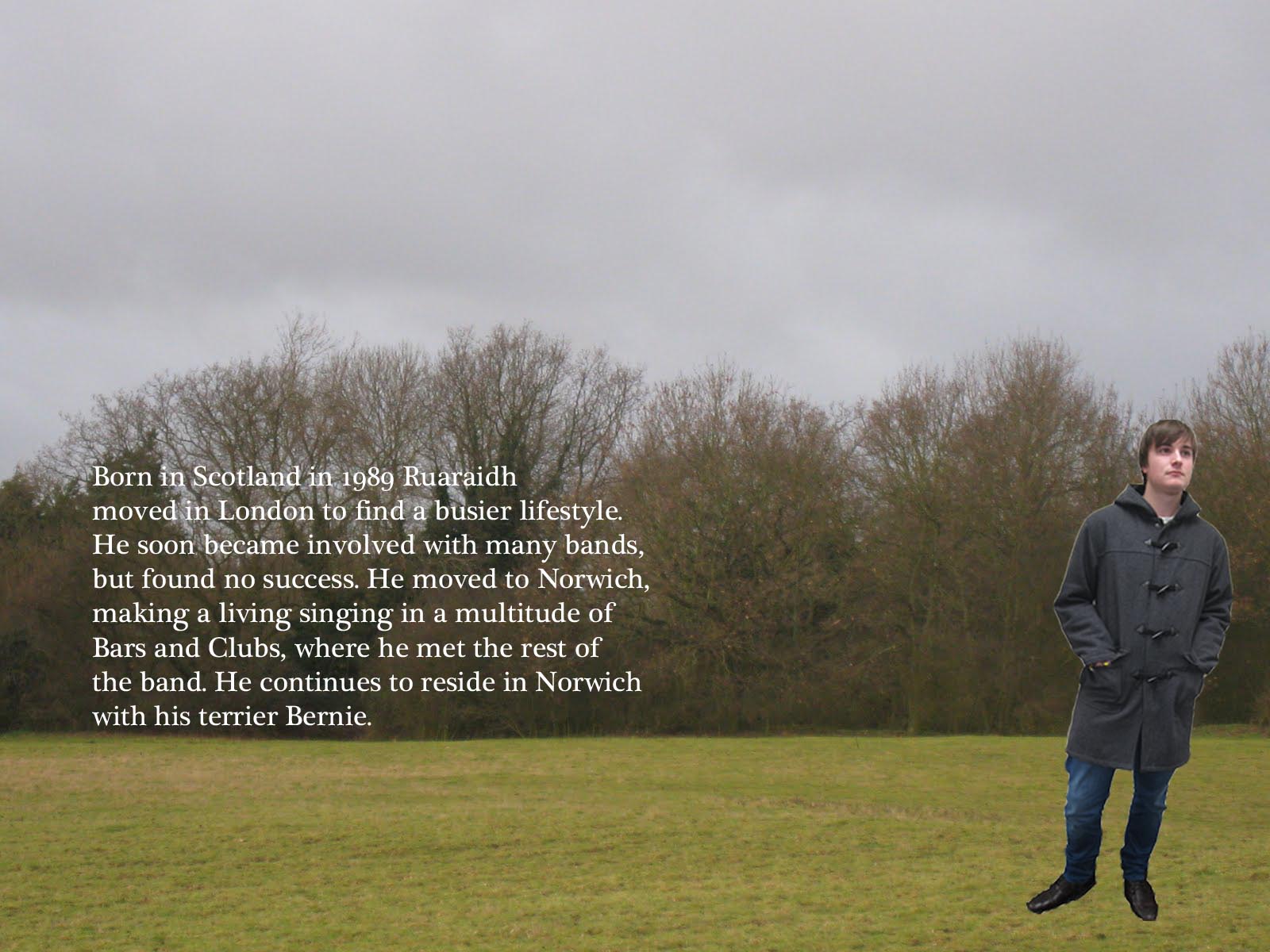
Hannah Biography

Dan at lake (guitar)

Dan at lake positioned

Dan biography

Front Cover
 Hannah at lake
Hannah positioned at lake

Hannah Biography

Dan at lake (guitar)

Dan at lake positioned

Dan biography

David at lake (lead male)


David positioned at lake


David Biography

Ren at lake (bass)

Ren Biography


Ren at lake (bass)

Ren Biography

Photos from filming

Lyrics of the Islands

Mock up of Front cover (not going to use, as the image isn't the best)

The back cover


Thursday 3 February 2011
Outer layer of the Digipak
Here are the images for the outside layer of the digipak. This is where the Band members find each other, finally creating the group on the fourth image.


This is the firt edit with the lead female singer in, however the lighting was all wrong in the original photo, so I have edited the brightness so that its the same as the other three band members.


This is the firt edit with the lead female singer in, however the lighting was all wrong in the original photo, so I have edited the brightness so that its the same as the other three band members.
Page Editing for Digipak
Here are the thanks pages which I have created. Here we thank the public, family and friends, the company which represents the band and to our inspirations... Below are the images for the digipak.

Editing the colour of the Thanks page. This is for two reasons, firstly it higlights the two lead singers in the centre of the archway. Also it makes the writting easier to read.


Editing the colour of the Thanks page. This is for two reasons, firstly it higlights the two lead singers in the centre of the archway. Also it makes the writting easier to read.

Tuesday 1 February 2011
Filming Images
Here are a couple of images which were taken throughout filming which I can use for the Digipak, as i love the arched look around the two lead singers. This will be good to add the lyrics/writting into the gap above the actors and between the trees. This image could also be used for the front page or back page.


Mock up of front cover...
Due to Hannah being in a Drama Exam Rehersal, we did not have the camera to upload the images which I took of the band members for the Digipak. However, instead of sitting in a lesson doing nothing, which we would never do, Ren and I decided to so a mock up of the Digipak Front cover, playing with different fonts, colours. However, the image which we used was cut from the music video, so therefore when editing in large scale the image will be pixilated.
Anyway, here it is...
 I do like the way in which the XX looks like a reflection in the lake, like shown on the left with the reflected image of the two lead Singers of the band.
Anyway, here it is...
 I do like the way in which the XX looks like a reflection in the lake, like shown on the left with the reflected image of the two lead Singers of the band.
Guitarist and more editing
Also today, we filmed the guitarist playing the Bridge within the song. We filmed this in the park at Thurston, as we were unable to get to the lake location, as we filmed duing lunch time and therefore needed a near location as we all have lessons in the afternoon. This worked well as we found a couple of trees to film next to, allowing it to look like the other three locations, even though it isn't. We did three types of shots, extreme close up of both the body and neck of the guitar. We also did a long shot of Dan (the guitarist) playing the guitar.
Then, during our lesson today we edited this footage into the music video, over the bridge. This broke down the lake 'walking entrance', as before this editing session, this clip was very long. This new editing also makes the music veido snappy and exciting to watch.
Then, during our lesson today we edited this footage into the music video, over the bridge. This broke down the lake 'walking entrance', as before this editing session, this clip was very long. This new editing also makes the music veido snappy and exciting to watch.
Photos for Digipak
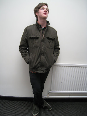
Ok, so today at lunch time I pestered and poked all of our actors within our music video, the two lead singers, the guitarist and bass player to wear the same or at least simular outfits to what they wore for the music video. Apart from our lead female singer, as Hannah was occupied by a drama exam rehersal, all opliged. So I now have the photos for the digipak. I plan to use photoshop to cut out the images of our actors and place them onto the backgrounds all all three locations. This is for two reasons. Firstly, what with the acotrs having jobs at the weekends, to be able to get everyone at the location at the same time is neon impossible. Also this 'cut out' look is very Indie, fitting perfectly with our Indie video/music/look.
Below are the images of which I have captured of the lead male singer, the bass player and the guitarist:
Lead Male Singer


Below are the images of which I have captured of the lead male singer, the bass player and the guitarist:
Lead Male Singer


Guitarist


Bass


From these I'm going to photoshop them out and overlay with the picture of the three locations.


Bass


From these I'm going to photoshop them out and overlay with the picture of the three locations.
Subscribe to:
Posts (Atom)